If I were to have my own personal Quilt Show.........

Since I went to that guild quilt show somewhat recently, it got me to thinking.
Which of my quilts would I like to put into a show if I had the opportunity?
There are lots of things to consider and getting down to even 20 would be hard, but these are the ones I would put in a show, if I could. It’s not for the quilting - but for the design/top itself. My quilting would be surely be critiqued to the max ! But since this is a hypothetical, it doesn’t really matter.
Here goes.
Flat Top Scrappy Pyramids

Pattern: mine - based on a basic tumbling block. Electric Quilt program (EQ) helped me figure out the measurements.
Inspired by - my desire to try something that was 3-D ish and still use up 2” pieces.
(I want to explore this idea further.)
Regrets - when taking the picture I took it with the sun coming in behind it so you can see the lines in the backing.
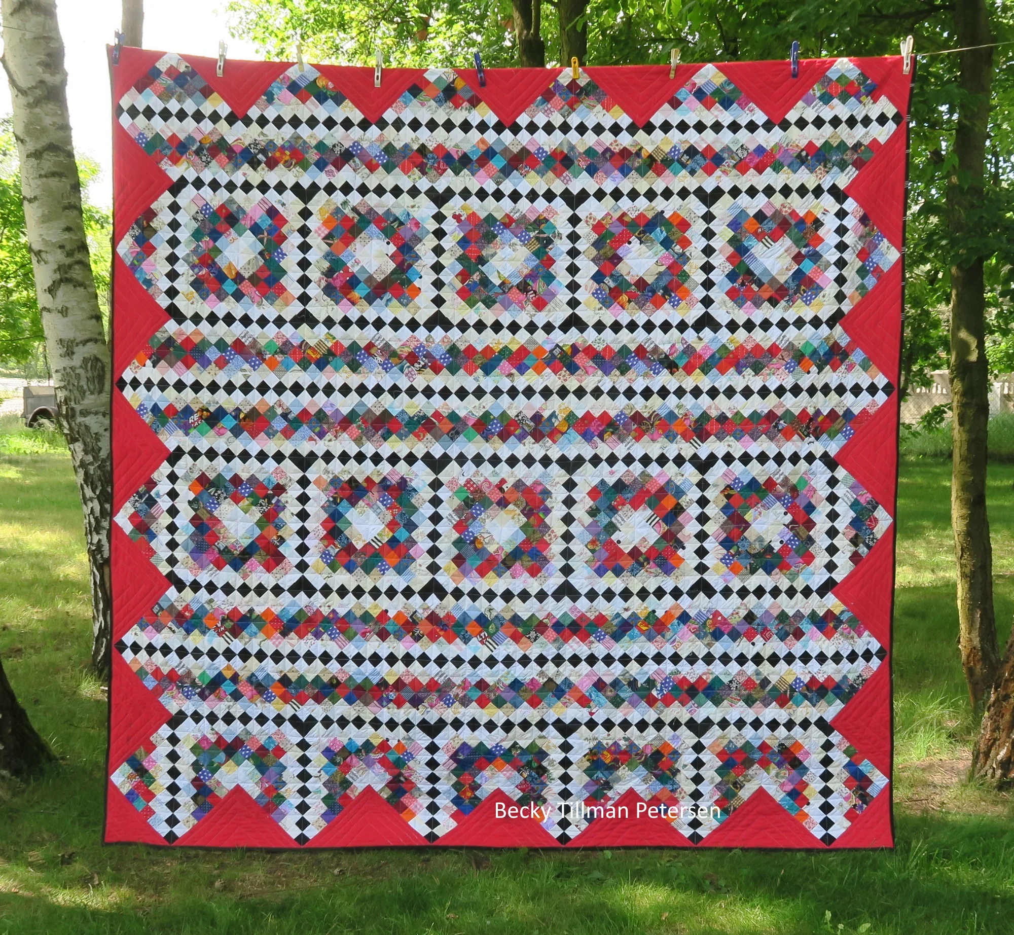
2. Warm Fuzzies

Design: mine -
Inspired by - things that make me feel good - thus the title.
The blocks are simply pixelated . I’m sure way back in my mind, I was also inspired by Lego bricks since my kids had a lot of them when they were growing up!
Regrets - that I didn’t quilt it with a swirly design instead of using a walking foot and straight line quilting. A swirly design would have hidden better where things weren’t perfectly lined up. Straight line quilting kind of showed off where things weren’t lined up straight.
3. Fantasia

Design: mine
Inspired by: a desire to use up my 2” strips! I think it turned out cool.
Regrets - none
4. Arapaho Roads

Design: mine - and my EQ program
Inspired by - our mission board is based in Arizona, USA. While out there, we have seen a lot of native American themed items. I thought this looked sort of like one of their rugs.
Regrets - none. I fell in love with this one - I hadn’t expected to, but upon completion I really liked it!
5. DNA Wrap

Design - mine
Inspired by - The squashed look came about by accident with a slip of the finger while working with the EQ program. I thought it was kind of neat and worked on getting the math to work and be do-able. these are the same middle squares as with my pattern Balls and Chains.
Regrets - none
6. Urban Development

Design - mine
Inspired by - the need for a light and airy scrappy quilt - colorful. The basic block in the middle and the surrounding frame are really super simple. The sashing strips are simply pieced squares - a checkerboard of color/white/color/white with white on each side.
I really like the feeling of this one. It makes me feel cooler - so it’s perfect for warm weather!
Regrets - none
7. Blades of Color

Design - mine
Inspired by - the desire to play with the same basic blocks a 9 patch, some half square triangles and varying sashings and negative space
Regrets - That I straight line quilted it - I think a swirly all over design would love looked much better.
8. Test Pattern #49

Design - mine
Inspired by - The desire to see how I could use the same basic building blocks and come up with different looking designs by a variation of the usage of color and orientation. This is the third of three - the other two are Arapaho Roads and Blades of Color.
These three all use basically the same building blocks.
Regrets - I didn’t finish out the design - and instead used that gray sides as setting triangles. I want to do it again only making the design to the edges of the quilt.
9. Kachelofen
Design - mine - based on playing around with blocks in EQ
Inspired by - old ceramic tile furnaces found in very old buildings and castles here in Poland. We had one in our church building which my husband tore apart when we installed different heating. Sometimes they were very decorative.
Regrets - none
10. Granny’s Selfies

Design - mine
Inspired by - a satirical work on the Granny Square block surrounded by the chains which as a frame to the granny square block - thus the title, “Granny’s selfies”. The desire to constantly take pictures of yourself - it’s a fascinating social phenomenon going on today. I thought in this case the “granny squares” could be taking their own photos.
Regrets - The outer gray - I had to use it because I ran out of the lighter gray in the middle and it was a bit too heavy/thick - so I wish I had had a better gray to use. At first I was regretting that I needed to use a darker gray on the outer edge, but in the end, I like it, so it is one of those happy accidents.
However, the design itself - it may be my all favorite of my own patterns. I’ve not seen anything like it elsewhere (not saying it’s not there - just that I’ve not seen it!).
11. Mod Rails

Design - Rail fence blocks
Inspired by - my desire to make a 100% upcycled quilt look cool. Most of the fabrics are bedding - sheets - but maybe curtains in there as well. All purchased at local second hand shops.
Regrets - some of the spiral quilting could be better, but overall, no real regrets.
12. A Nod to Mod

Design - mine
Inspired by - wanting to use up various blocks in a rail fence design
Regrets - I almost ran out of fabric so I had to use the lighter sections of the bedding - making for some strange looking spots - if I had had plenty of fabric I would have not used the lighter pieces - choosing all one color as the background.. However, it is part of the charm of this 100% upcycled quilt.
13. Show Off
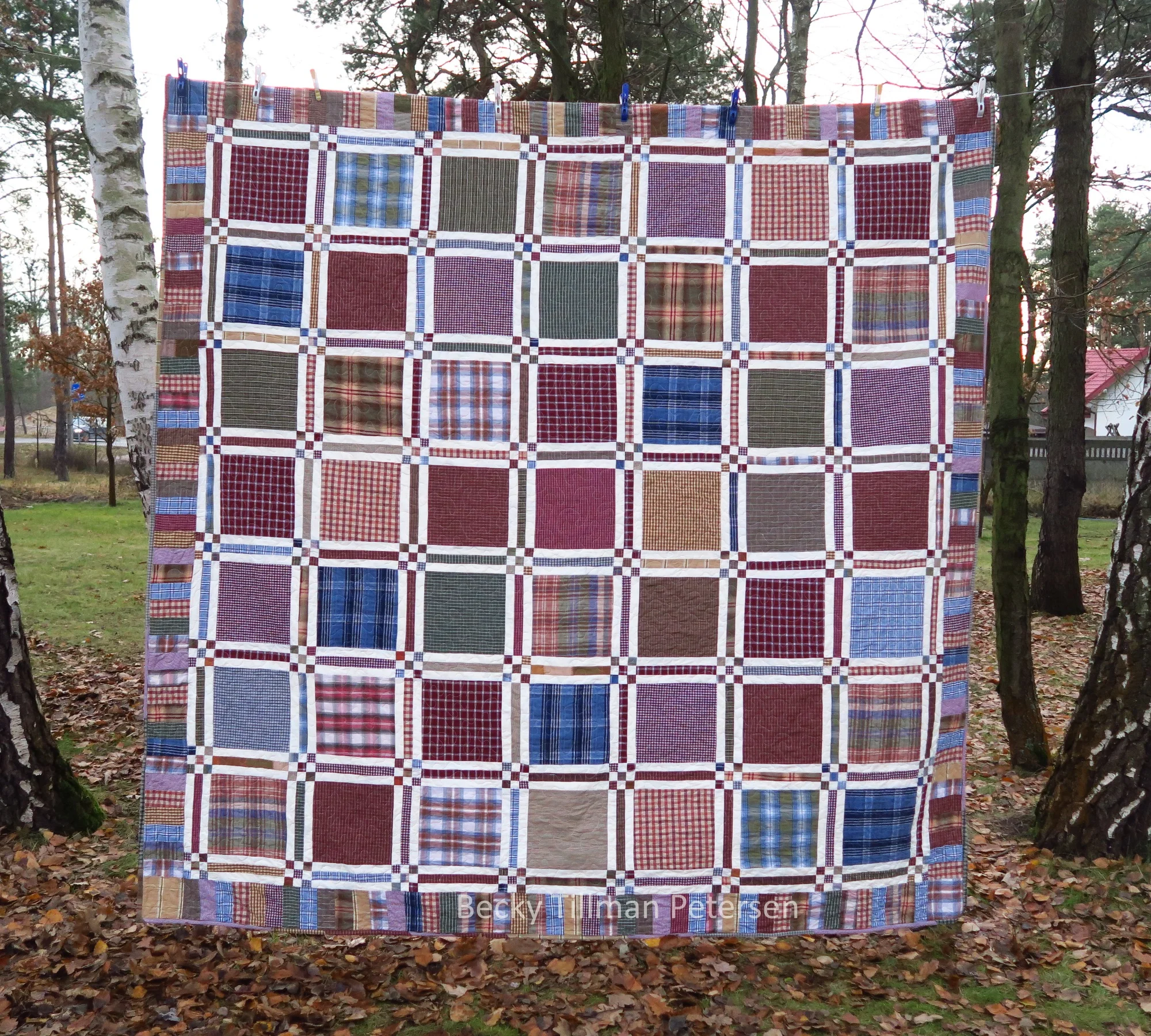
Design - classic - plain squares, 9 patches and a rail fence sashing
Inspired by - my desire to NOT cut up the fabric into small pieces - I was, no doubt, feeling rebellious at the seeming need to cut all fabric into tiny pieces - which then negates the design of the fabric itself and relegates it to color alone! I wanted a very “guy friendly” quilt that was easy. It’s on our bed. My husband loves it. I wanted all these second hand shirts to shine! It’s part of my 100% upcycled series.
Regrets - none
14. Happy Scrappy Burgoyne Surrounded

Design - classic Burgoyne Surrounded block
Inspired by - wanting to make a light and airy one as I had made a couple of this pattern before in a civil war look - tans, browns, dark reds, etc. I opted for pretty, fun, light-hearted. I checked out several blogs. I made it as a quilt along in a Facebook group I am in.
Regrets - This 100% upcycled quilt has a few spots where I could have been more careful choosing the fabrics. I noticed while quilting, for example, that one or two of the pieces had a buttonhole slit in it. I don’t know why I didn’t notice that while piecing. I had to quilt over the buttonhole and make sure that it was no more! Normally I didn’t keep the section of blouses where the buttonholes were but we had bought some second hand fabrics from a lady back in 2015 and she “very carefully” took all the blouses apart and ironed everything! I generally don’t keep that section of the shirt and definitely don’t bother to work with that kind of finesse when de-constructing a shirt.
15. Double Nines

Design - classic double 9 patch
Inspired by - wanting to make a 9 patch as part of a quilt along in a Facebook group I’m in - but not wanting a simple 9 patch. I was fascinated with the idea of gray, black, and red.
Regrets - since I was using 100% upcycled fabrics for this, I used what I had. No regrets. People have told me it reminds them of their grandfather, dad, etc.
16. Autumn Wishes

Design - mine
Inspired by - a challenge by Pat Sloan to make a top with the star block. I put it in this layout, reversed the colors, used a scrappy sashing, and added a checkerboard border for a look all my own.
Regrets - this 100% upcycled quilt was made using what I had - and I don’t have any regrets with my fabric choices for this one.
17. Starring Monkey Wrenches

Design - a classic block put on point with a star sashing in the middle
Inspired by - a block called Goose in the Barn Door (if I remember right - it’s 9 patches and rail fence blocks) - combined with my desire to try a blue/white quilt
Regrets - none, but I didn’t realize that the whites were so different til I took it outside to get a picture after it was all finished. My lighting inside my house does not show up these differences like this. This was the first in my upcycled blues series - all fabrics are second hand - shirts, blouses, bedding, etc.
18. Premium Labels

Design - mine
Inspired by - my desire to USE those labels AND to show the silliness of excessive pride over brand labels of your clothing. They all end up in the same place - either the garbage or second hand stores where I got these items for a few cents each. Another in my upcycled blues series.
Regrets - I wasn’t totally pleased with that plaid fabric used as a background. If I were going to do it again, I’d leave that fabric out . But after not looking at this quilt for some time, I do think it’s “ok” and works.
19. Double Star Beauty

Design - mine (and EQ’s)
Inspired by - my love of a simple Irish chain block but wanting it to be a bit more interesting.
Regrets - a couple of the blocks could have been better as to colors/contrast - esp. that green star with the plaid background. I wouldn’t do that again.
20. Triple Irish Delight

Design - Triple Irish chain block
Inspired by - argyle socks - but I didn’t realize it til someone mentioned that. I was just playing with color in the EQ program and came up with this variation. Another in the upcycled blues series.
Regrets - none
21. On the Plus Side

Design - a simple plus sign block and a chain block
Inspired by - vintage wallpaper - made me think of something my Great Aunt Mary would have had in her house. I visited with my dad when I was about 10.
Regrets - that I ran out of one of the fabrics and had to substitute another one for a few of the light blue blocks. But that’s how it is when you are using second hand fabrics. (This is part of my upcycled blues series).
And there you have it. These may not be the only ones I’d put in there, but they’d by my top 21 that I’ve finished (or at least that’s what I think today - tomorrow maybe I’d think differently!)
I’ll bet you’ve never seen a quilt show where they have a place for “regrets” on the description box!
Enjoy your day!
From my computer chair!
Be sure to check out what my sis has for you in the store!


Colors may vary slightly from what is portrayed. Screens vary as well as our eyes sometimes see things differently, but we've made every attempt to have the color be accurately portrayed.
Price is by the Yard.