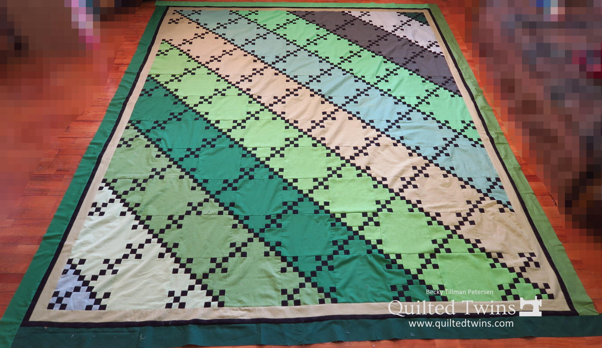
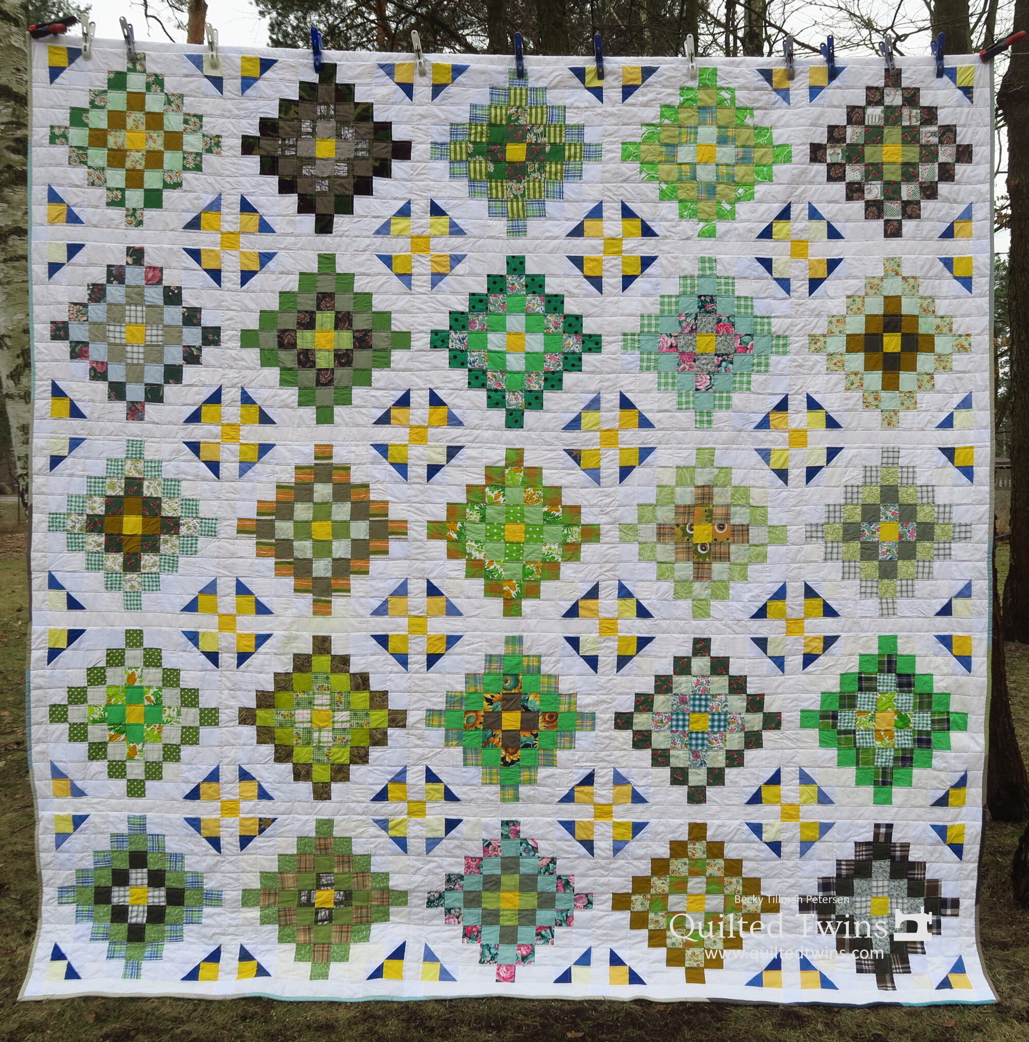
"Positively Quiet" - UP Greens #16 top finished

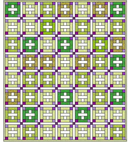
I noticed that I still had more light green solids to use up and I began to play around with this + block. Guess what? These two things happened at about the same time. I have been looking at my boxes of fabric a lot lately just to keep reminding myself what’s in there.
I wanted to make some serious headway with these rather uninspiring pieces of fabric. I had the same thoughts about these as I did with Bars and Stripes - the quilt I featured yesterday. There is not much exciting about them, but I decided to let them shine in their quiet way with white and a few splashes of color here and there. Those darker fabrics I used are on purpose. I wanted some darker color to provide some interest. If they were all quite light, I thought it would simply be too boring.
All solids here. While some look brown, they are all have at least a greenish cast to them.

The whites I used on this were very soft - older fabrics. That’s why they look like they do around the cornerstones. They seemed to stretch out of place. I will probably quilt this quite heavily with poly batting - then it will look fine!
I wanted this quilt to be nice and quiet - demure, almost shy, but capable. That was the look I was going for.

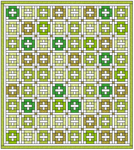
I knew that by using my lighter greens I had to go with an even lighter color for the corner blocks or else a lot darker. I played around with purple on the program - but said “Nah!” when I saw it. Didn’t like it.
Let me show you that one - and see what I thought it was ‘nah’. But honestly my overriding fear was that the purple that I have might not “go with” the greens that I have and it would end up being hideous!
Then I plugged white in there and I loved the look.
So I went for it. I knew that some of my light greens are light and would suffer a bit with the design. But in the end, I think it is okay. A few of the blocks are quite light which means there isn’t a lot of contrast - but I think in outside sunshine when I take the final photos of the finished quilt, you will be able to see the plus signs at least “okay” if not fine.
I still have some of the light green and I keep trying to use it as background fabric.
In the end, I’ve been opting for white or off white as backgrounds in most of my quilts so far simply due to the wide variety of greens I’ve been using. I thought that a mint green might not look good with the various greens in these tops. White seemed to me a better option. Maybe it’s too safe. I don’t know.
I’m trying to make something that pleases me MORE than I’m trying to make a point of using up all the light greens quickly.

Late in my Upcycled Blues series, I did make a top with a + plus. I had a lot of 1.5” strips at that point. I’m not that far along here in my Greens series yet. I still have enough of some fabrics to keep to larger blocks.
Oh, I also used the + sign in one of the 2” quilts here. I called it Operation Hope and was thinking about Swiss Army knives when I made it and the red cross symbol. You can click on the links and you should get the patterns if interested.


So here is the new update for the series.
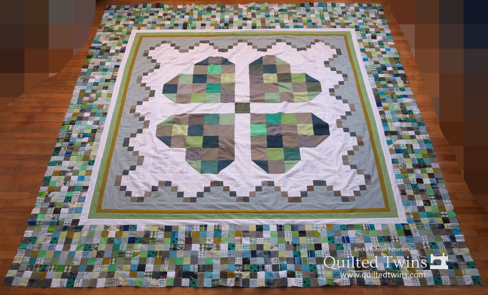
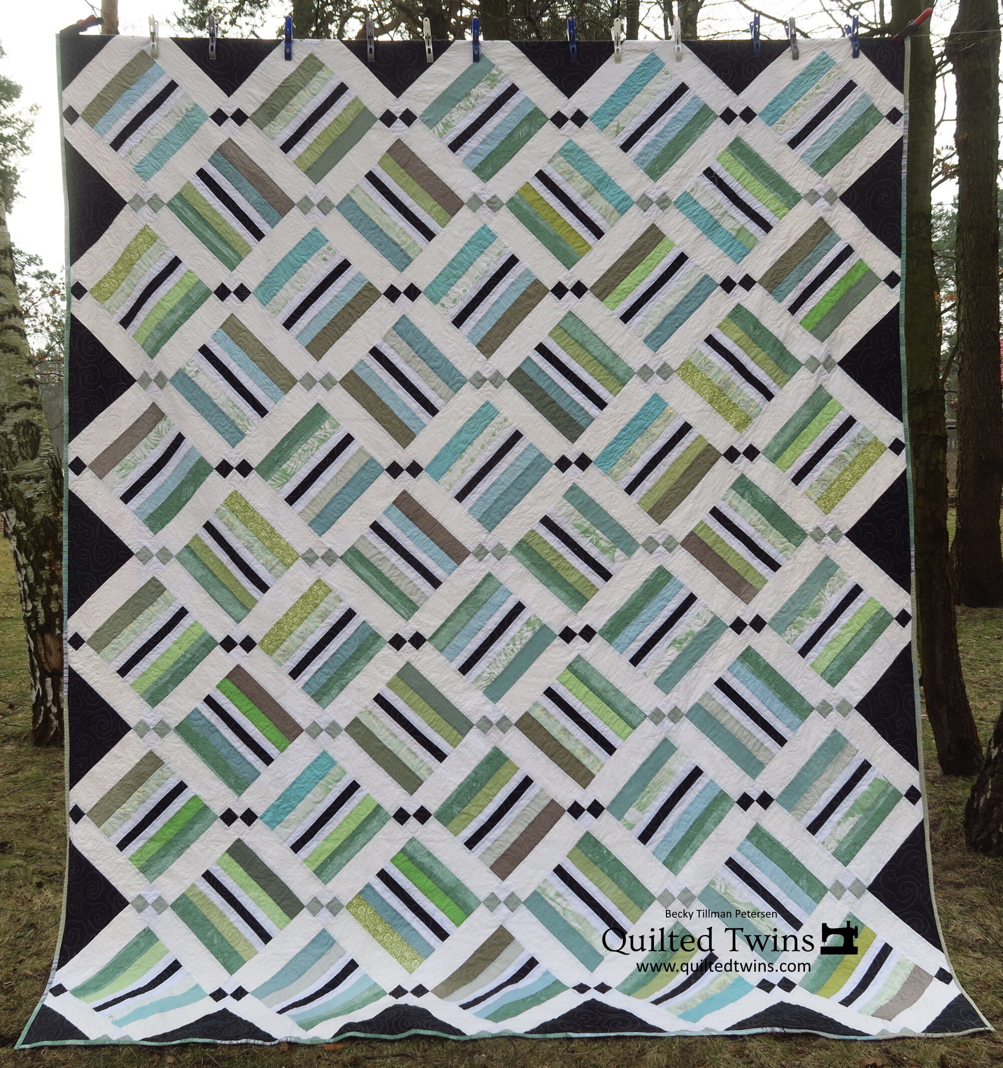
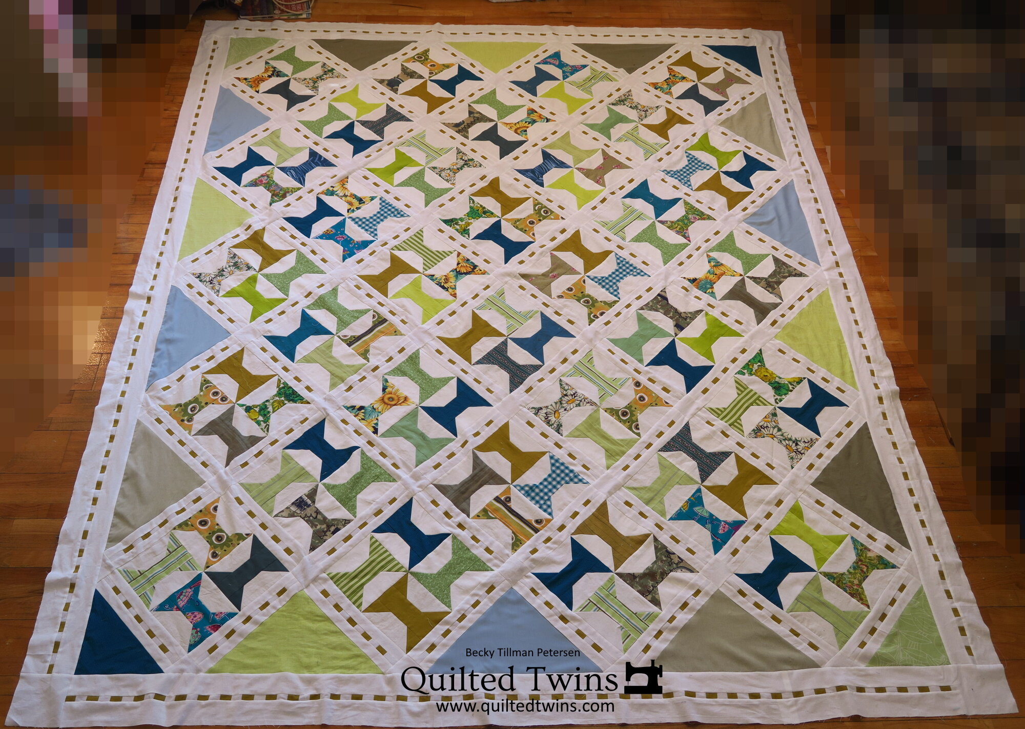
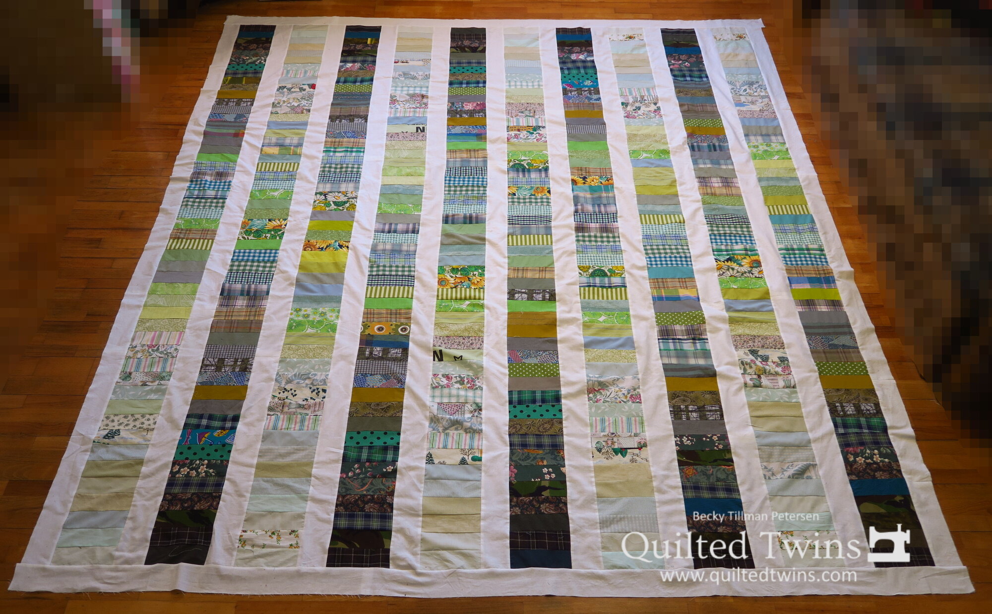
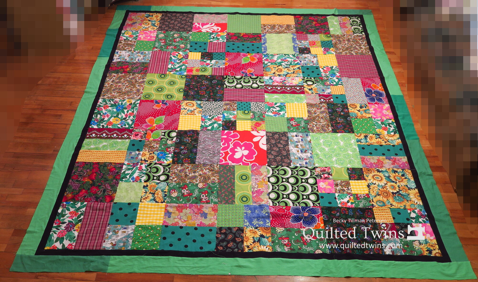
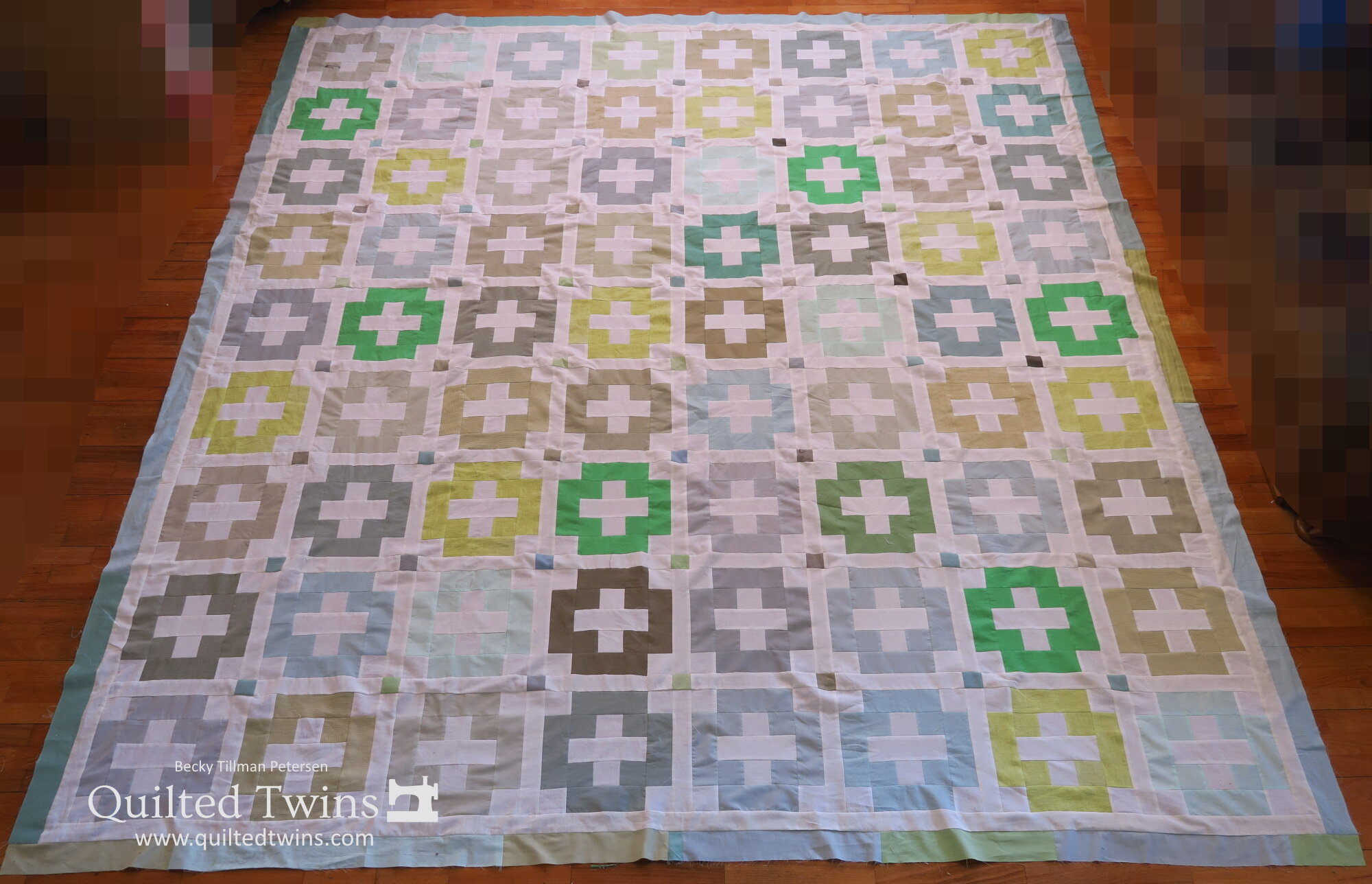
Upcycled Greens series to date


And that’s one of the things I’ve been doing lately. I trust you have a great day. Stay safe!
Thanks for coming along on my quilting journey with me!
Be sure to check out what my sis has for you in the store here!
Here’s one of the beauties we have!
