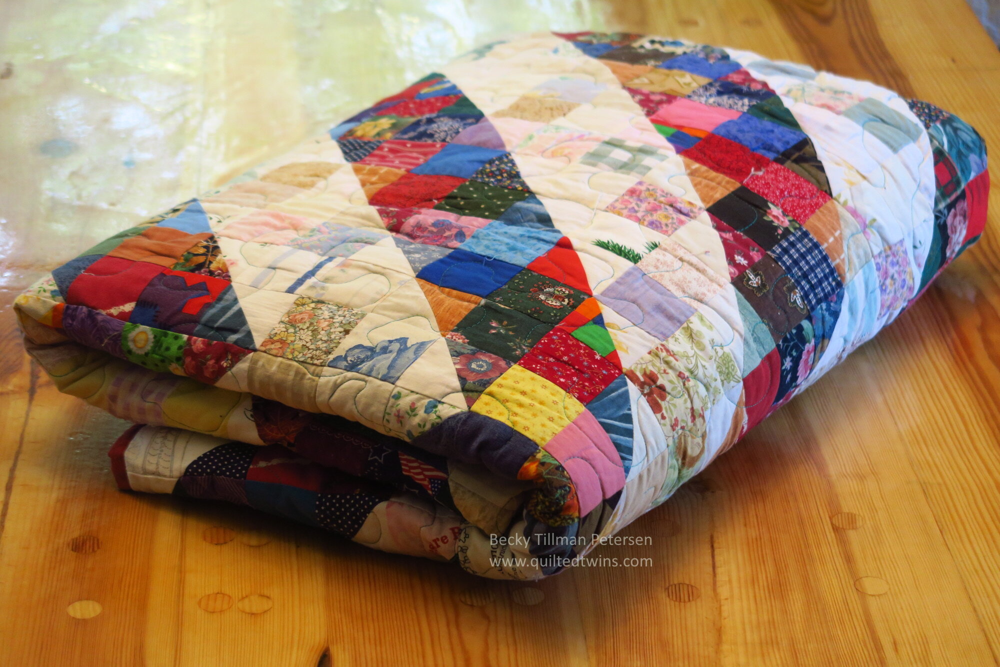
"Scrappy Split 9 Patch"
It’s not so very old - just older than all the rest of my more recent quilts. I made it well before I started blogging. I decided this one deserved some good photos and it needs to be memorialized in my 2.5” list of quilts.
The block in this quilt is made up of 2.5” squares and 2.5” HST so in the quilt the block finishes at 6”.
The block is a simple 9 patch using some lights, some darks and 3 HST. I used all 2.5” squares.
The block looks like this:
And just like the variations of layouts you have available when you use a regular HST (myriads of them!), you have dozens of them with this block!
I decided on this layout and I like it!
It was the first time my husband expressed an opinion that it wasn’t “balanced” and thus bothered him.
I was actually taken back by that for a while, and then I had to deal with it. I did. I told him just not to think about it. (I am pretty sure he was exaggerating as on a close up scale, you don’t really see the whole pattern - as you sit on the bed, you see the individual blocks or bit of the design).
I decided about then that this was “my” crayon box - not my husband’s. While I don’t tell him how to make something as he plays with woodworking, I decided I wouldn’t worry about it if he thinks something is ‘off’ in my quilting. It is simply his opinion and he is entitled to it just as anyone else is. But “he” doesn’t control what I make or design—I can’t do that and still be “me”. At that point, the design would be “his” design or at a minimum, a collaboration.
I worried about that for a while because I didn’t want to disrespect my husband by making something he thought was “off”. I had to just get over it and realize that one doesn’t equal the other.
Layout. The quilt finishes at 96” x 96”.
So, whether or not it is “off” to you (I call it asymmetrical) or you really like it - it doesn’t really matter to me - I made it like it is, and I like it!
To me it is far more interesting than putting the halfway point in the center and working out! That would be fine - but this is more interesting to me.
I learned a lot doing it about value and colors. Some of the blues you see up close in the lights could have easily gone with the darker section if they had been surrounded by darks.
I saw how often that medium value square can go on either side - just surround it with the value you want it to be!
You can see that overall, the design works as I did it. but there were a few places that I could have done a better job than I did.
What I discovered was that if I could keep the “dividling lines” crisp and clean looking - then the design was better. For example, there is a lighter green HST in the photo above that to me was poorly done. I should have not put it there. But once it was done, I was not going to redo it!
But in the end, all is fine. No one looking at it is confused at where the design is or what it is supposed to be. That was my goal.
I made this one after I started using the Electric Quilt program (version 6 at this time) but before I wrote any patterns. You can see how I made it if you want to make something similar, you can use the layout I put here in this blog post.
Obviously you could do the same using smaller or larger of these Split HST blocks as well. The quilt would either have more detail or less, depending on what sizes you used.
The quilt roll -
The first time I tried to take pictures of this quilt the wind was whipping and it just wasn’t right conditions, so I tried again just recently. This time, all was calm and I was able to get better shots. Enjoy the pretty grass. My husband works hard on it!
Enjoy!
Have a great day wherever you are reading!
Be sure to check out what my sis has for you in the store!


Colors may vary slightly from what is portrayed. Screens vary as well as our eyes sometimes see things differently, but we've made every attempt to have the color be accurately portrayed.
Price is by the Yard.
100% cotton
41/43" wide
Local quilt shop quality fabric
Chelsea - Beehive and Bees on White
by Northcott Fabrics